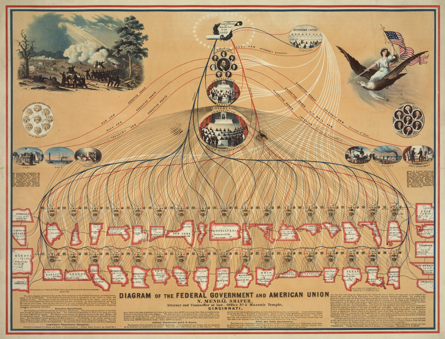
Guided Primary Source Analysis: Diagramming the Federal Government

Zoom into a detailed view of this diagram. Read the text and carefully review the data. Create a bulleted list of the information you learned from the diagram. What does the text in the third column say is the purpose of this diagram? Do you think the diagram fulfills this purpose? Why or why not?
Based on the information provided in the diagram, what year do you think this diagram was created? Find and list at least three pieces of evidence from the diagram that support your supposition. Check your evidence-based guess with the dated listed in the bibliographic record. How close did you come to guessing the year this source was created?
Read one of the articles linked to below. Based on the criteria listed in the article, is this “Diagram of the Federal Government and American Union” a good infographic? Why or why not? What changes to the data or presentation of the data might make this diagram a better infographic and update it for today?
- 10 Tips for Designing Infographics San Fran Beat
- Themes For A Good Infographic Understanding Graphics Understanding Graphics
- The Anatomy Of An Infographic: 5 Steps To Create A Powerful Visual Spyre Studios
What other observations, reflections or questions does this source inspire? Let us know!
