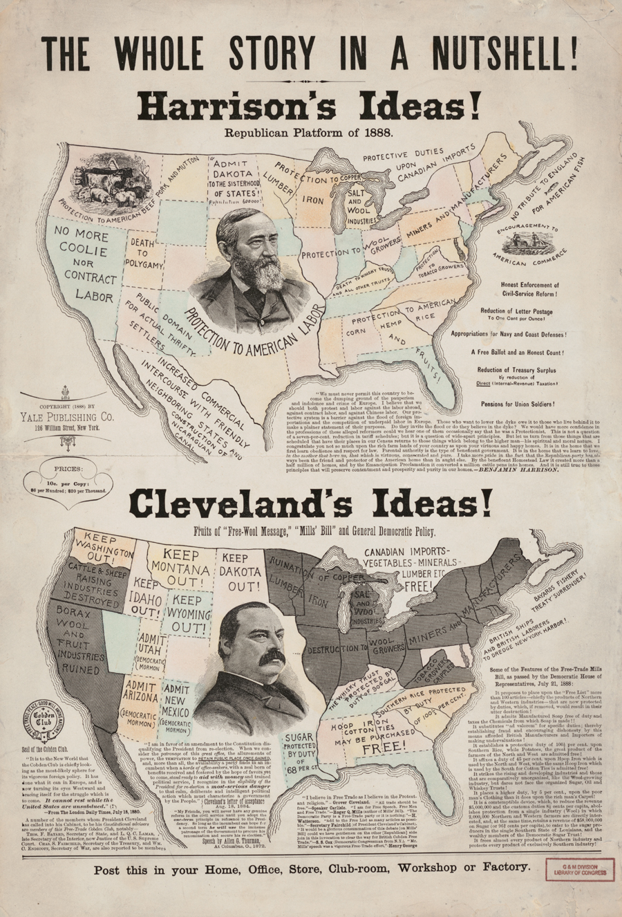
Guided Primary Source Analysis: Presenting Party Platforms
Zoom into this 1888 presidential election document online or in a .pdf document. Look closely at the graphical elements of the complete document and compare and contrast the presentation of information in the Harrison and Cleveland maps. Which is more pleasing visually and why? How does the visual presentation affect the tone of each map? Describe your findings using specific details from the maps to support your conclusions.
Now compare and contrast the textual information presented on each map. How are the differences in party platforms presented? How does word choice affect the tone of each map? In what ways does the structure of each map’s text affect the meaning you derive, or take away, from each? Explain your findings, including which party you think was responsible for creating this document, using specific details from the maps to support your conclusions.
Create a similar document for another presidential election, with two maps depicting the platforms of the two major party candidates. You may choose to present the candidates objectively or slanted towards one candidate. After, swap documents with a partner, analyze the other’s document, and then discuss your findings.
What other observations, reflections or questions does this source inspire? Let us know!
Related resources

